In the previous article, I told you how to insert a line chart in excel. In this article, I will tell you what is the difference between a line chart and a stacked line chart in excel. I will also tell you how to create a stacked line chart & 100% stacked line chart in excel.
1. What Is The Difference Between A Stacked Line Chart and A Line Chart In Excel?
- The line chart can clearly reflect the characteristics such as whether the data is increasing or decreasing, the rate of increase or decrease, the trend of increase or decrease, and the peak value.
- But in the stacked line chart, each series no longer only represents its own sales quantity but represents the sum of all previous series and its own sales quantity, that is, the cumulative value.
- The line chart is often used to analyze the changing trend of data over time, as well as the interaction and influence of multiple groups of data over time.
- A stacked line chart can not only show the value of each series but also show the total value of all the series in the same period.
- A stacked Line Chart is used to display the trend of the proportion of each series value over time or ordered categories. It may display data points to represent single data values, or it may not display these data points.
- If many categories or values are approximate, a stacked line chart without data points should be used.
2. How To Create Excel Stacked Line Chart.
- We also use the data cells in the article How To Insert Line Graph In Excel to render the stacked line chart.
- Select the cell range A2:D14 in the example data cells.
- Click the Insert tab —> Insert Line or Area Chart icon in the Charts group.
- Then you can click the Stacked Line or the Stacked line with Markers button in the 2-D Line section to create the stacked line chart.
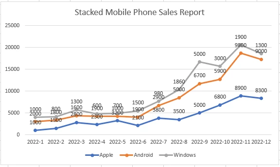
- From the above chart, we can see that the vertical number value of each marker point is the accumulation of the 3 series number value.
3. How To Create Excel 100% Stacked Line Chart.
- The 100% stacked line chart is similar to the stacked line chart.
- The difference is that the Y-axis of the chart is the percentage of the stacked series.
- Select the cell range A2:A14 in the example data cells.
- Then click the Insert tab —> Insert Line or Area Chart icon in the Charts group.
- Click either the 100% Stacked Line or the 100% Stacked Line with Markers icon to insert the stacked line chart.
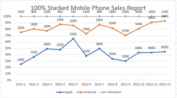
- From the above chart, we can see that the Y-axis is all the 3 series percentage ( each-serie’s-value / total-series-value ) accumulation.
- For the first point, Apple serie’s value is 1000, Android serie’s value is 2000, and Windows serie’s value is 1000.
- So the total series value is 1000 + 2000 + 1000 = 4000.
- So the Apple serie’s percentage is 1000/4000 = 25%, the Android serie’s percentage is 2000/4000 = 50%, and the Windows serie’s percentage is 1000/4000 = 25%.