If you want to add an average line to an Excel chart, you can use the Excel combo chart. The Excel combo chart can draw multiple figures in one chart. And you can select different chart types for different chart series. This article will tell you how to draw the average line in an Excel chart using the Excel combo chart.
1. How To Draw Average Line In Excel Chart Using Excel Combo Chart.
1.1 Example Data Cells.
- Below are this example’s source data cells, the first column is the month list, the second column is the revenue of each month, and the third column is the average revenue of all the monthly revenue.
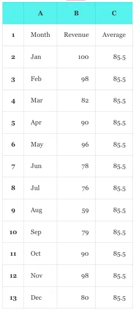
- We just need to input the data in columns A and B, and the data in column C is calculated by a formula automatically.
- Input the formula =AVERAGE($B$2:$B$13) in cell C2 and press the enter key, then it will display the average number of all the 12 month’s revenue in cell C2.
- The formula uses the Excel AVERAGE function to calculate the average number of the provided cell range.
- Please note, the cell range must use the absolute reference, otherwise it will calculate the wrong number in the following cells.
- Select the cell C2, and it will display a small square at the bottom right corner of the cell.
- Move your mouse key over the square and the mouse pointer will be changed to a cross icon.
- Press the mouse key, and drag the pointer down to cell C13.
- Then it will copy the original formula =AVERAGE($B$2:$B$13) to every cell in the cell range.
- Then you can see all cells in the range contain the same average number.
- Click one cell in the cell range such as C3, you can see the cell contains the formula =AVERAGE($B$2:$B$13) also.
- If you do not use the absolute reference in the formula, then it will change the formula value in cell C3 to =AVERAGE(B3:B13), and the resulting number will be different.
1.2 How To Use Combo Chart To Create A Chart With Average Line In The Chart.
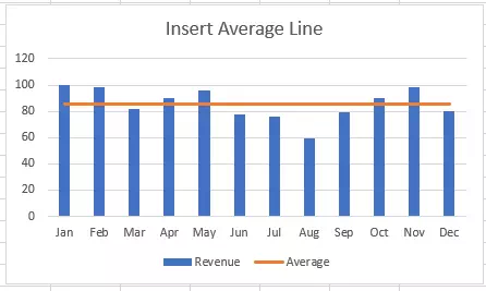
- Select cell A1, press the Shift key, and click the cell C13 at the same time to select the cell range A1:C13.
- Click the Insert tab —> Charts group —> Recommended Charts item to open the Insert Chart dialog window.
- Click the All Charts tab in the above pop-up dialog window.
- Then click the Combo item in the window bottom left side.
- On the window’s right side, it will select the default combo chart type Clustered Column – Line.
- It will list all the chart series at the bottom of the right side, each series in one row.
- The list column name is Series Name, Chart Type, and Secondary Axis.
- In this example, there are 2 series rows in the list.
- The first series row’s Series Name is Revenue, and the default selected Chart Type item is Clustered Column.
- The second series row’s Series Name is Average, and the default selected Chart Type item is Line.
- When you click the OK button, it will display the below-clustered column chart with the average line in the chart.
1.3 How To Change The Series Chart Type In The Combo Chart.
- You can change the series chart type in the combo chart after you create the above clustered column-line combo chart.
- Click the above chart to select it, then click the Chart Design tab on the Excel top menu bar.
- Click the Change Chart Type item in the Type group.
- It will open the Change Chart Type dialog window.
- It will show the All Charts tab and select the Combo item in the window’s bottom left side automatically.
- On the window top area of the right side, it will select the Custom Combination icon automatically.
- Then you can change the chart type for each series in the combo chart series list on the window bottom area.
- In this example, we change the series Revenue‘s chart type from the item Clustered Column to Line.
- After clicking the OK button, you can get the below line chart, the blue line is the Revenue series and the orange line is the Average revenue series.
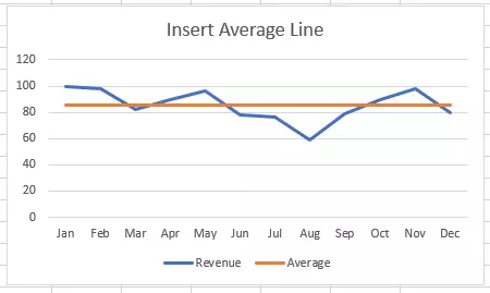
- The above method can be used to draw any line in an Excel combo chart besides the average line.