If you want to quickly figure out whether your data series is in the regular data range, you can use the Excel band chart. The band chart is a chart with horizontal bands ( which point out the regular or correct data wave range ) and lines with markers of your data series. This article will tell you how to create Excel charts with horizontal bands.
1. How To Create Excel Charts With Horizontal Bands.
1.1 Example Data Cells.
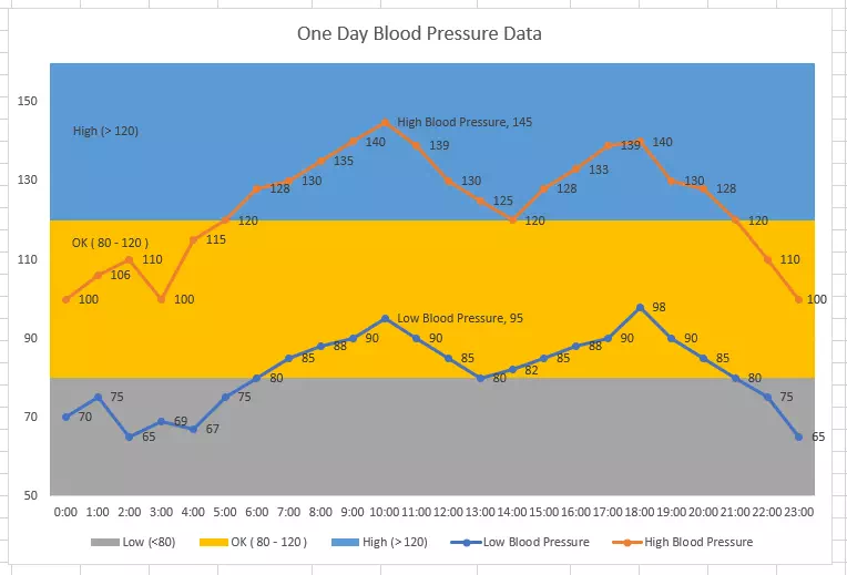
- Below are the example source data cells. It contains one person’s 24-hour blood pressure data.
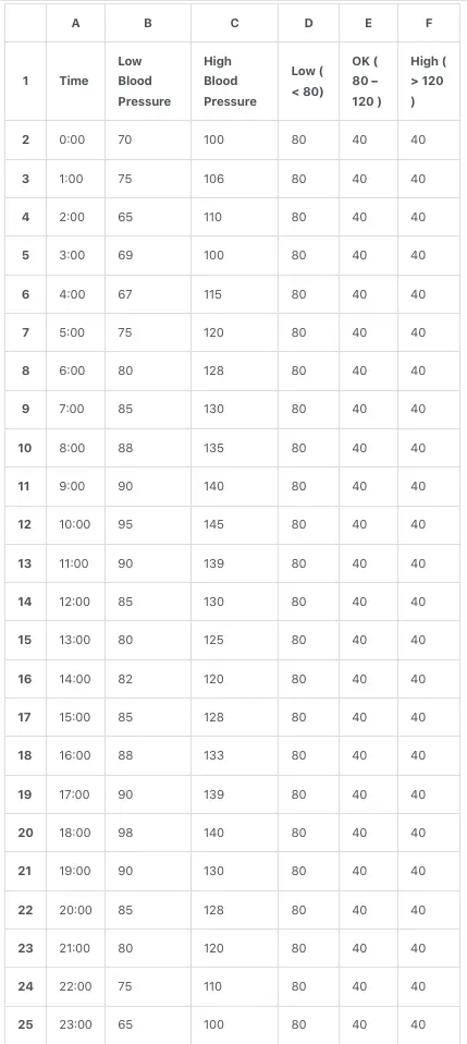
- Column A is the 24-hour time of one day, column B is the low blood pressure value, and column C is the high blood pressure value of each hour.
- Column D is the standard low blood pressure value (80). Column E is the standard high blood pressure value ( 120 = 80 + 40). Column F is the irregular high blood pressure ( 160 = 80 + 40 + 40 ).
1.2 How To Create Excel Charts With Horizontal Bands Steps.
- Select the cell range A1:F25, then click the Insert tab on the Excel top menu bar.
- In the Charts group, click the Insert Combo Chart icon to pop down the Combo drop-down list.
- Click the first item Clustered Column – Line to insert the Column-Line combo chart.
- Click the chart title and change the title to One Day Blood Pressure Data.
- Click to select the Excel combo chart on the worksheet, then click the Chart Design tab on the Excel top menu bar.
- Click the Change Chart Type item in the Type group to open the Change Chart Type dialog window.
- Select the chart type Line with Markers for the Low Blood Pressure and High Blood Pressure data series.
- Select the chart type Stacked Column for the Low, OK, and High data series.
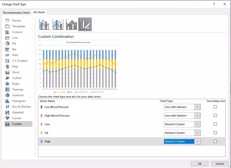
- Click the OK button to save the settings.
- Right-click any stacked column bar in the chart, then click the Format Data Series… menu item in the popup menu list.
- Then it will show the Format Data Series pane on the Excel right side.
- Slide to change the value of Gap With to 0% in the Format Data Series pane, and then you will get the below chart.
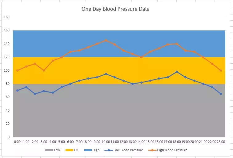
- In the above chart, the vertical axis value does not match the blue band exactly.
- We can right-click the vertical axis and then click the Format Axis… menu item in the popup menu list.
- It will show the Format Axis pane on the excel worksheet’s right side.
- Go to the Axis Options —> Bounds section, you can change the vertical axis minimum & maximum bound value in the related text box.
- Input the number 50 in the Minimum text box and the number 160 in the Maximum text box.
- Click to select the left first column of the blue band in the chart (select only the first column not many).
- Then click the Chart Design tab —> Add Chart Element item in the Chart Layouts group.
- Click the Data Labels —> Center item to add a data label at the center of the left first column.
- Right-click the left first blue column and click the Format Data Label… menu item in the pop-up menu list to open the Format Data Label pane on the Excel worksheet’s right side.
- In the Label Options —> Label Contains section, check the checkbox Series Name and uncheck the checkbox Value, if you uncheck the Value checkbox first, then you can not find the Series Name checkbox because the data label is removed.
- Do the same to the other 2 bands ( yellow band and grey band ).
- Right-click the yellow line or blue line, then click the Add Data Labels —> Add Data Label to add the data label value in the line marker points.
- Select any one and only one marker point in the line graph and right-click it, then click the Format Data Label… menu item in the pop-up menu list.
- Check the checkbox Series Name on the Excel right side Format Data Label pane, then you can see the below Excel band chart.