The Excel waterfall chart is a special kind of column chart. It has a beginning column bar and an ending column bar on the graph’s left and right edges. The other column bars between the 2 column bars represent the increase and decrease of values between the 2 edging values. This article will tell you how to create a waterfall chart in Excel with examples.
1. How To Create a Waterfall Chart In Excel With Examples.
- The below excel table is the example table, it contains the month and the monthly revenue income accordingly.
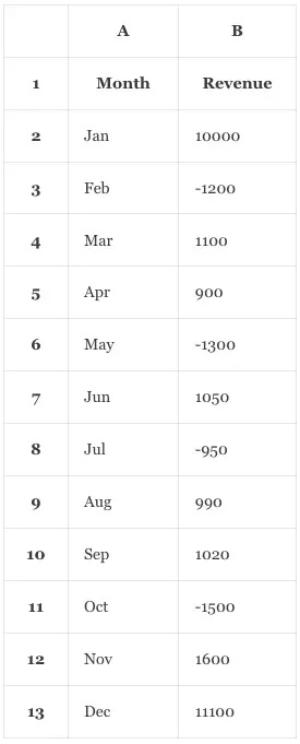
- To create the Excel waterfall chart, you should select the cell range A1:B13, then click the Insert menu in the Excel top menu bar.
- In the Charts group, click the down arrow beside the icon item “Insert Waterfall, Funnel, Stock, Surface, or Radar Chart”.
- Then click the Waterfall icon in the drop-down icon list, then it will create a draft waterfall chart in the Excel worksheet as below.
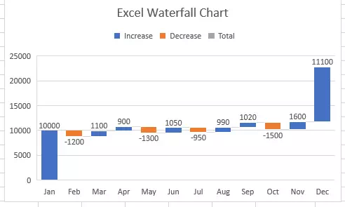
- The above Excel waterfall chart is just a draft waterfall chart, you can see there are 3 legends in the chart.
- The blue legend represents the Increase value, the orange legend represents the Decrease value and the grey legend represents the Total value.
- But in this example, the grey legend should represent the initial and the final revenue of the year.
2. How To Change The Initial & Final Column Bar’s Color To Grey In The Excel Waterfall Chart.
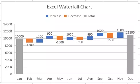
- In the above Excel waterfall chart, the initial and final month’s revenue column bar’s color is blue.
- Now we need to change the initial and final column bar’s color to grey.
- Double-click the initial blue column bar, then it will open the Format Data Point pane on the Excel window’s right side.
- It will select the Series Options tab by default on the pane, if not click it to select.
- Check the checkbox Set as total, then the first column bar will change its color to grey.
- Double click the last column bar and check the Set as total checkbox also, then you will get the below waterfall chart.
3. How To Change The Waterfall Chart Title & Axis Title.
- Double-click the chart title of the above waterfall chart.
- Then you can edit the current chart title.
- Click the chart to select it, then click the plus icon ( + ) on the top right corner of the chart.
- Then check the checkbox before the Axis Titles item, it will display both the horizontal and vertical axis title.
- If you just want to show the horizontal axis title or vertical axis title only, you can click the arrow after the Axis Titles item, and then check the checkbox before the Primary Horizontal or Primary Vertical to show them accordingly.
- Then you can edit the Axis Title by double-clicking it.
4. How To Change Waterfall Chart Axis Scale.
- Click the waterfall chart to select it, then click the plus icon ( + ) on the top right corner of the chart.
- Click the Axes —> More Axis Options… menu item.
- Then it will open the Format Axis pane on the Excel worksheet’s right side.
- Click the down arrow on the right side of the Axis Options item.
- It will pop up an item list containing a Horizontal Axis and a Vertical Axis.
- Click the item Vertical Axis then it will expand the Axis Options.
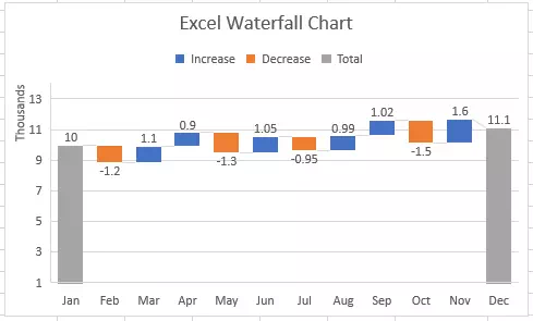
- Then you can change the vertical axis scale by changing the Minimum and Maximum number in the related text box.
- You can also select the different Display units values from the Display units drop-down list to simplify the vertical axis numbers.
- If you want to make the user see the Display units that you select, you can check the checkbox Show display units label on chart.
- Now you will see the Excel waterfall chart like the below one. In the below waterfall chart, the vertical axis scale is changed to 1000, and the display unit is Thousands. You can compare the below chart with the above chart in section 2.
5. How To Change The Legend Position In Excel Waterfall Chart.
- Click to select the Excel waterfall chart.
- Click the plus icon ( + ) on the chart’s top right corner.
- Check the checkbox before the Legend item to show or hide the chart legend.
- Click the arrow after the Legend item.
- Then you can select the Legend position by selecting one of the Right, Top, Left, and Bottom items.