This article will tell you how to make a salary comparison chart in excel. It will compare 12 monthly salaries of 3 employees. Then you can see the salary trend of the employees and decide who will cost the most salary in the employees.
1. How To Make A Salary Comparison Chart In Excel Example.
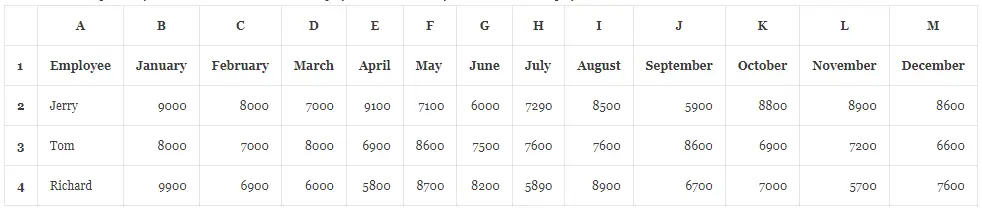
- Below is the example salary source data cells. There are 3 employees and 12 monthly salaries of the 3 employees.
- Select the cell range A1:M4, and click the Insert tab —> Charts group —> Insert Column or Bar Chart down arrow —> Clustered Column item in the 2-D Column group.
- Then it will create a clustered column chart in the worksheet.
- Click the chart title and change the title text to Salary Comparison Chart.
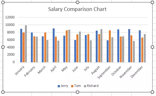
- The above column chart compare the 3 employee’s salary for each month visually.
- If you want to compare different month’s salary for one employee, you can click to select the chart.
- And then click the Chart Design tab —> Data group —> Switch Row/Column item to get the below chart.
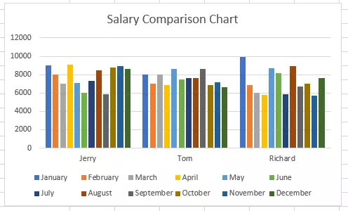
- The above chart switch the rows and columns of the first chart, then you can see each employee’s salary data change for every month of one year.