I have 2 columns in an excel file, one is Date the other is Temperature, when I want to insert a line chart based on the two columns, it can not insert the chart as I want. It only show the Date value in the chart title, but what I want is that it shows the temperature line chart based on date. That is the horizontal axis is date and the vertical axis is temperature. In this article, I will tell you how to fix this issue.
1. Identifying the Issue.
- When attempting to create a line chart using date and temperature columns, users might encounter a situation where the chart title displays only the Date values, and the temperature is missing from the vertical axis.
- This issue often arises due to the presence of text-formatted cells in the Temperature column.
2. Recognizing the Warning Indicator.
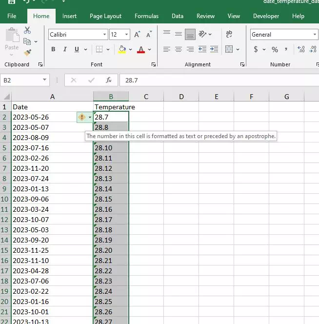
- To identify text-formatted cells, first click the cell column to select it.
- And then look for a yellow warning icon displayed in the top-left corner of a cell within the Temperature column.
- Hovering over the icon will reveal a message indicating that the number in the cell is formatted as text or is preceded by an apostrophe.
3. Converting Text to Number Format.
- To address this issue, click on the yellow warning icon, triggering a dropdown menu.
- From the menu, select the “Convert to Number” option.
- This action will transform the cell or entire column from text to number format, eliminating the formatting obstacle preventing accurate chart creation.
4. Verifying the Transformation.
- After converting the text-formatted cells to number format, ensure that the entire Temperature column now displays numerical values without the yellow warning icon.
- This verification is crucial to guarantee the success of the line chart creation process.
5. Inserting the Line Chart.
- With the Temperature column now in the correct numeric format, you can confidently insert a line chart based on the two columns.
- Select the Date and Temperature columns, navigate to the “Insert” tab, and choose the desired line chart style.
- The resulting chart should accurately represent temperature trends over time, with the horizontal axis displaying dates and the vertical axis reflecting temperature values.
6. Conclusion.
- Resolving issues related to text-formatted cells is a crucial step in creating accurate and meaningful line charts in Excel.
- By identifying the problem, converting text to number format, and verifying the transformation, users can ensure that their charts provide a clear representation of data trends.
- Following these steps empowers users to harness the full potential of Excel for effective data analysis and visualization.