This example will tell you how to create excel stacked column chart. It includes 2-D, 3-D, and 3-D Bar stacked column charts, and 100% stacked column charts.
1. How To Create Excel 2-D Column, 3-D Column, 2-D Bar, and 3-D Bar Chart.
- The excel stacked column chart is based on the column chart.
- So we should first create a column chart in excel.
- This example will use the example source data in the article How To Insert Line Graph In Excel.
- Select the cell range A2:D14, then click the Insert tab.
- Click the Insert Column or Bar Chart down arrow in the Charts group.
- Then it will show a drop-down column or bar chart list.
- There are 4 groups of column or bar charts, they are 2-D, 3-D, 2-D Bar, and 3-D Bar.
- Click the Clustered Column item in the 2-D Column section will create the basic 2-D clustered column chart.
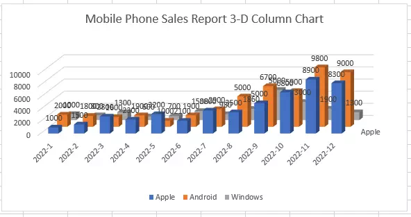
- Click the 3-D Column item in the 3-D Column section will create the basic 3-D column chart.
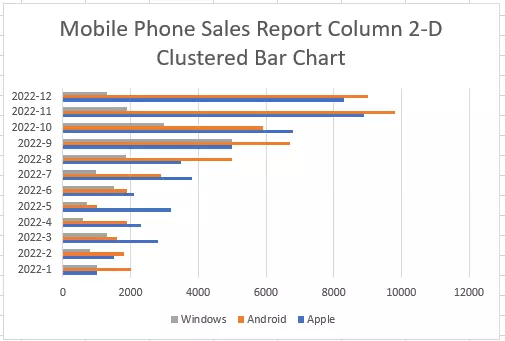
- Click the Clustered Bar item in the 2-D Bar section will create the 2-D clustered bar chart.
- Click the 3-D Clustered Bar item in the 3-D Bar section will create the 3-D clustered bar chart. It is similar to the 2-D clustered bar chart, the difference is that it is a 3-D bar.
2. How To Create a Stacked Column / Bar Chart Or a 100% Stacked Column / Bar Chart.
- If you do not know the difference between a chart and a stacked chart, you can read the article What Is The Difference Between Line And Stacked Line Chart?
- For each group of the column or bar charts, there is a stacked chart and a 100% stacked chart.
- Still use this example data, you should select the cell range A2:D14 first.
- Then click the Insert tab —> Charts group —> Insert Column or Bar Chart down arrow.
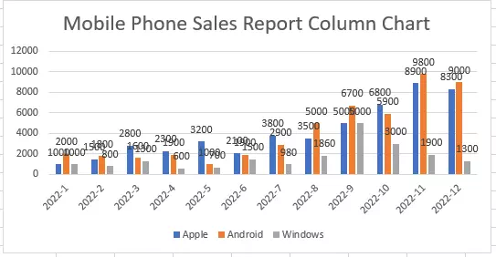
- Then click the Stacked Column icon in the 2-D Column group to create a stacked column chart.
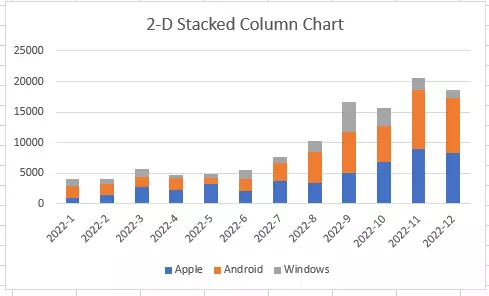
- Each column in the above chart contains 3 series value’s summary.
- In this example, the blue part of one column represents the Apple phone’s value, the orange part of one column represents the Android phone’s value, and the gray part of one column represents the Windows phone’s value.
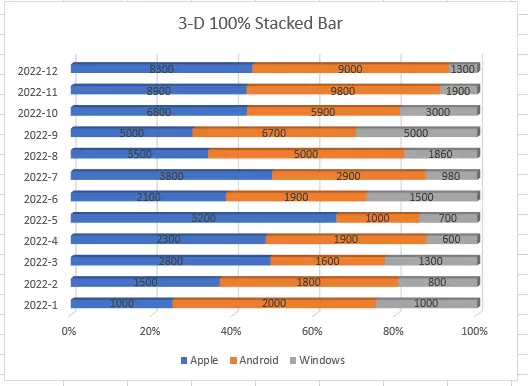
- When you click the 100% Stacked Column icon in the 2-D Column group, it will create a 100% Stacked Column chart.
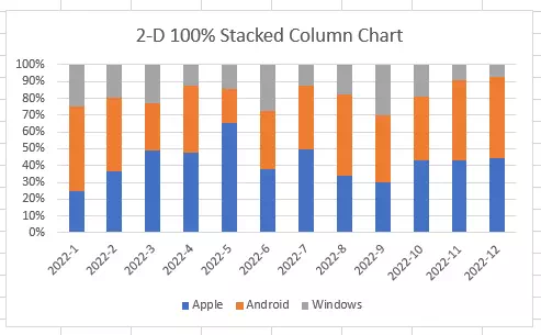
- In the above chart, each column contains 3 serie’s percentage of the total 3 series value.
- For example, the first column contains 3 parts, that are blue part, orange part, and gray part.
- The blue part represents the Apple phone’s percentage of the total sales number which is 25%.
- The orange part represents the Android phone’s percentage of the total sales number which is 50%.
- The gray part represents the Windows phone’s percentage of the total sales number which is 25%.
- If you want to see the data value for each series in the column, you can select the chart, then click the plus icon on the chart top right , and check the checkbox Data Labels.
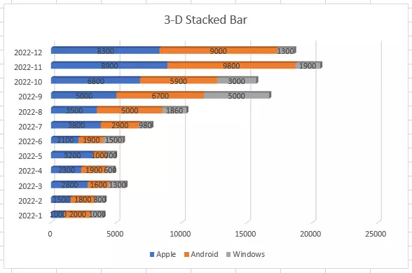
- Select the cell range A2:D14, then click the Insert tab —> Charts group —> Insert Column or Bar Chart down arrow.
- Then click the 3-D Stacked Bar icon in the 3-D Bar group to create a 3-D stacked bar chart.
- If you click the 3-D 100% Stacked Bar icon in the 3-D Bar group, it will create a 3-D 100% stacked bar chart.