In this article, I will tell you how to insert a line graph in excel step by step. The line graph is based on a sales report table. It will also tell you how to change the line chart data range, trendline, color, and axis type.
1. Create The Sales Report Table.
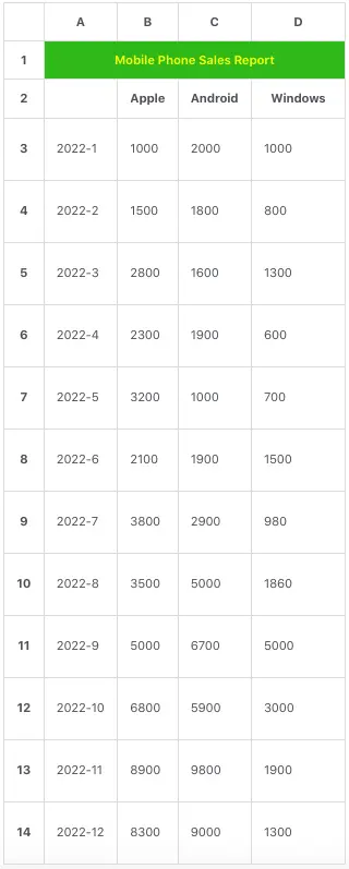
1.1 Create Sales Report Table Title.
- The first thing is to create a sales report table and input or import the sales data.
- Open a worksheet, and select cells range A1:D1.
- Right-click the above cells range A1:D1, then click Format Cells… menu item in the popup menu list.
- Click the Alignment tab in the popup Format Cells dialog window.
- Check the checkbox Merge cells to merge the 4 cells.
- Click the Font tab, select Bold in the Font style list, and select the text color (yellow) from the Color drop-down list.
- Click the Fill tab, and select the color green to fill the cell range background.
- Click the OK button to save the cells’ formatting.
- Input the text Mobile Phone Sales Report in the merged cells.
1.2 Create The Sales Report Data Table.
- Input the category title Apple in cell B2, Android in cell C2, and Windows in cell D2.
- Input the text 2022-1 in cell A3, click the Home tab, and select the item Short Date from the Number Format drop-down list in the Number group.
- Click the small square at the bottom right corner of cell A3 and drag the mouse pointer down to cell A14.
- Then it will insert the year-month value in the next 11 cells automatically.
- Now input the mobile phone sales data for Apple, Android, and Windows as below table.
2. How To Insert Line Graph In Excel Based On The Above Table Data.
2.1 How To Create The Line Chart.
- Select the cell range A2:D14.
- Click the Insert tab —> Insert Line or Area Chart icon in the Charts group.
- Then you can click the Line button in the 2-D Line section to create the below line chart.
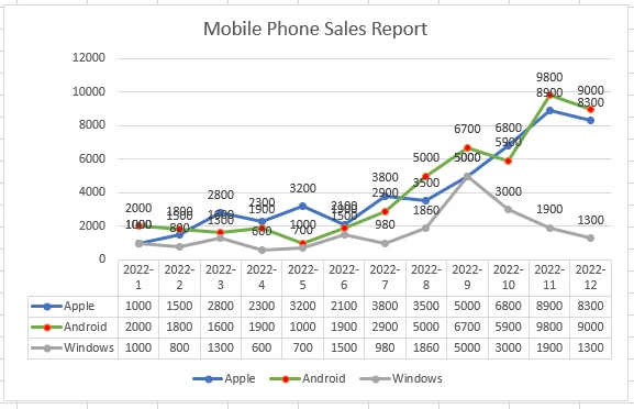
- You may wonder how can I add the marker, data label, and data table in the above chart, I will tell you how to do it later in this article.
- There are 6 2-D line charts and 1 3-D line chart in the menu list, you can try to select them to see the results.
2.2 How To Change The Chart Data Range.
- Click to select the line chart, then it will display a Chart Design tab on excel top menu bar.
- Click the Chart Design tab, then click the Select Data icon in the Data group.
- Then it will pop up the Select Data Source dialog window.
- There are 2 lists in the dialog.
- The left list is the Legend Entries(Series) which contain the legend items in the line chart.
- And the right list is the Horizontal(Category) Axis Labels which contain category items that will be shown on the horizontal axis.
- You can check or uncheck the checkboxes before the list items to show or hide them from the line chart.
- In the Legend Entries(Series) list, there are 3 buttons which are Add, Edit, and Remove.
- You can click the button to add, edit, or remove the legend entries.
- You can also click the Switch Row/Column button to switch the Legend Entries(Series) and the Horizontal(Category) Axis Labels list items.
2.3 How To Add Trendline In Line Chart.
- Click to select a line in the line chart.
- Then click the plus icon ( + ) on the top right corner of the chart.
- It will show the Chart Elements menu list.
- Click the arrow after the Trendline item in the menu list.
- Then select one trendline type such as Linear Forecast.
- If you find the trendline types are not enough, you can click the More Options… item to open the Format Trendline pane in Excel right side.
- Click the Trendline Options item ( the third item ) in the pane.
- Then you can configure the trendline type and other options.
2.4 How To Change The Line & Markers Color In Line Chart.
- Right-click a line in the line chart.
- Click the item Format Data Series… in the pop-up menu list to open the Format Data Series pane on the Excel right side.
- Click the Fill & Line icon in the Series Options section.
- Click the Line icon to show the Line options.
- Then you can change the line color by selecting the color from the Outline color drop-down list.
- Click the Marker icon to show the Marker options.
- Click the Fill item to expand it, and then you can select the Marker‘s color from the Fill Color drop-down list.
2.5 How To Change Line Chart Axis Type.
- Right-click the Horizontal(Category) Axis in the line chart.
- Click the Format Axis… item in the popup menu list.
- It will open the Format Axis pane on excel’s right side.
- Click the Axis Options icon ( the fourth icon ), then you can change the Axis Type by selecting the related radio button.
- There are 3 axis types, Text axis, Date axis, and Automatically select based on data.
2.6 How To Add Data Label To Line Chart Marker.
- Select the line chart, then click the plus icon ( + ) on the top right corner of the chart.
- Then click the arrow after the Data Labels item and then select the data label position on the chart marker.
- Make sure the checkbox before the Data Labels item is checked, then you can see the data number value for each marker in the line chart.
2.7 How To Add Data Table To Line Chart.
- Select the line chart, then click the plus icon ( + ) on the top right corner of the chart.
- Check the checkbox before the Data Table item.